Quill: Glossary
Abbreviation
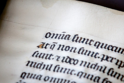
Abbrev. – From ‘app’ to ‘math’: abbreviating words is human. Why write words in full if a shorter version will do? Medieval scribes agreed. The manuscripts they made are usually packed with abbreviations. Perhaps the most common is the macron: a line above a letter that represents the letter n or m.
Another popular abbreviation mark is the 7-shaped symbol for ‘et’ (and). The number and kinds of abbreviations varied. Manuscripts with liturgical texts usually have few abbreviations, while they are abundant in those filled with university texts, such as Aristotle. Abbreviations may also be problematic. They are only useful, after all, if the reader can understand them.
Read more in Quill: Copying the Text
Bifolium
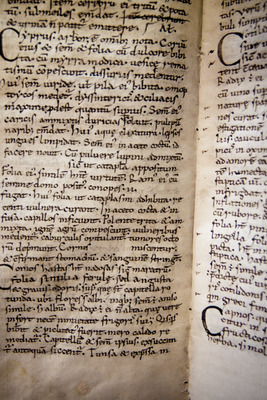
Bonding sheets – Quires are usually made from bifolia (singular: bifolium) or double sheets of parchment or paper. To create a bifolium, a sheet is folded in half (each half is called a ‘folium’, which consists of two ‘pages’, i.e. the front and back of the folium). If the quire is the building block of the medieval book, the bifolium is what defines the quire: four, five or six of them were bundled up and subsequently filled with text.
Looking closely at the binding of the book, each bifolium appears to embrace its neighbor, bonding together to produce a strong quire. Before roughly 1200, bifolia were usually cut from processed animal skins, each of which usually supplied one to three double sheets. They were either cut from the skin or the skin was simply folded, either once (folio), twice (quarto), or three times (octavo). Paper double sheets were exclusively produced by folding the full sheet.
Read more in Quill: Making Quires and Sheets
Binding Fragments
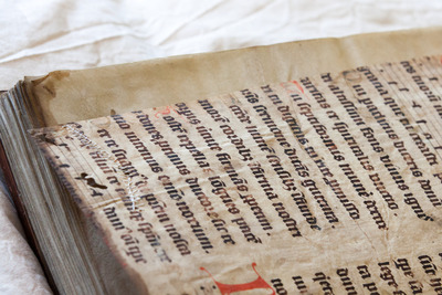
Stowaway – When Gutenberg invented moving type, handwritten books quickly went out of fashion. Many of these books became the victims of recycling at the hands of binders, who cut up manuscripts to use them for added support in the book bindings they made for new printed copies. Fragments could also serve as a flyleaf. Like cars at a scrap yard, medieval books were mutilated and plundered for parts until almost nothing was left.
Single pages and small strips were cut away from handwritten books and pasted onto the boards and spines of their printed cousins. There they remained, hidden out of sight, covered by the leather of the binding. In spite of their mutilated appearance, these fragments can be of great importance. The early history of the Bible, for example, could not have been written without the fragmentary evidence retrieved from early-modern bindings. While of modest size, the stowaways form ‘blips’ on the map of Europe, showing that a certain text was available at a certain moment and location.
Read more in Quill: Binding the Book
Boards
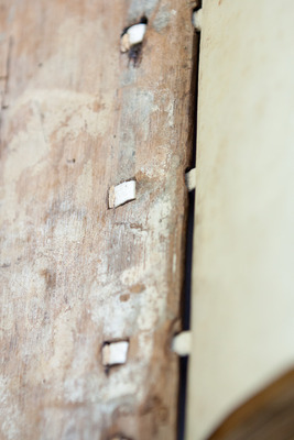
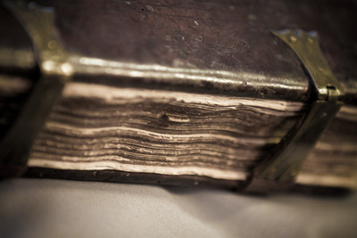
Woodwork – Medieval manuscripts, even small ones, can be surprisingly heavy. Giant Bibles, large volumes that can stand half a meter tall, weigh as much as twenty-five kilos. It requires two library staff members to carry the object to your table. Much of this weight is produced by the boards of the bookbinding. To protect the stack of quires that made up the actual manuscript, a wooden board was placed on the front and back. The quires were then tied to thin leather straps, which were pushed through channels drilled through the boards. The straps were pegged into the wood. It produced a surprisingly firm binding, which lasted for centuries. All this crafty woodwork is presently hidden from our eyes because the boards were subsequently covered with leather (which was often fitted with decorations. Thousands of pieces of medieval trees are hidden inside book bindings, like a shelved mini forest.
Read more in Quill: Binding the Book
Bookmark
Fossilized taste – The bookmark guided the reader to the beginning of a favorite chapter or a significant section of the book. Flowers or leaves, which were sometimes drawn into the manuscript, marked the page in the most elegant and practical manner. More permanent and secure, however, are bookmarks made from a piece of parchment that was pasted onto the page.
What a great thought, that medieval fingers inserted these stubs to get to their literary fix! Some bookmarks are fragments of redundant manuscripts, from which they were cut as a form of recycling. The stubs are interesting to book historians because they show what texts of passages were enjoyed by individuals that lived hundreds of years ago. They are the fossilized remains of medieval literary taste.
Read more in Quill: Binding the Book
Bosses and Clasps
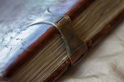
Add-ons – Many medieval books were a joy to look at even when they were closed. Various shiny ‘add-ons’ were drilled in and attached to the wooden boards on the outside of the book. The most pronounced of these are the so-called ‘bosses’, protective metal pieces attached to each corner of the binding. Much more common are clasps, pieces of metal that kept the book closed.
These were needed because, unlike paper, parchment has a tendency to expand, which could push the book open. A clasp was therefore needed to keep the book closed when not in use, protecting the text inside. Also frequently added to the binding is decoration - flower motifs, playful line patterns, and at times even a painted scene. Such decorative elements on the outside of the binding became particularly common near the end of the Middle Ages.
Read more in Quill: Binding the Book
Carolingian Script
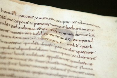
The unifier – Caroline Minuscule is the primary script of the early Middle Ages. Created in the late eighth century, it became the main book script in the empire of Charlemagne (d. 814). It is an elegant script with a particularly round and spacious appearance Because Charlemagne had conquered a vast amount of territory during his reign, he found himself with an empire of many cultures, each with its own manner of writing.
A cohesive and unifying script was needed if his administration was to function properly. Caroline Minuscule looks familiar to our modern eyes because producers of typeface working for early Italian printers used it as a model. In fact, the ubiquitous default font ‘Times New Roman’ on our computers is also based on Caroline Minuscule.
Read more in Quill: Copying the Text
Catchwords and Signatures
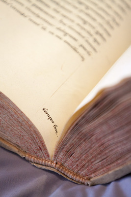
Location, location – As with our modern books, medieval manuscripts consist of quires: small packages of folded leaves. The scribe would copy the text onto the pages of the quire, which would later be bound together to form the completed manuscript. To make sure that each finished quire ended up in the correct order, the scribe often wrote the first words of the next quire in the lower margin of the last page he copied.
These are called ‘catchwords’.
If the catchword at the end of the quire matched the first word on the next quire, then they were in the correct sequence. Sometimes, to further help binders put the quires in the right order, scribes would number them. In the later Middle Ages, further organization was added to the page by also numbering the individual bifolia, so as to keep track of their specific location within the quire. In spite of all this emphasis on location, from time to time binders still jumbled up the sequence.
Read more in Quill: Making Quires and Sheets
Chapter Number
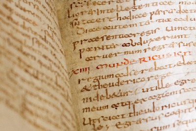
Chapter and verse – While running titles told the reader what text was found on a particular page, the chapter number narrowed down its contents even further. As with many other navigational aids, the practice of numbering the chapters goes back to the Carolingian Age. They appear to have become standardized much later, however, perhaps as late as the twelfth century.
In the thirteenth century, a Bible redaction was made in Paris (the ‘Paris Bible’) wherein the numbering of the chapters became standardized, something that was not a given before then. This meant that two individuals discussing Genesis 15 were actually talking about the same text for the first time. Many works used in university education had an additional tool to define the location within the text even more precisely, the paragraph.
Read more in Quill: Copying the Text
Clasps
See: Bosses and Clasps.
Colophon
See: Scribal Colophon.
Cursive Script
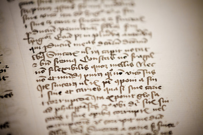
Migration of letter forms – Cursive script began its career in the world of administration. Here it was used for account books, charters and other administrative texts. The clerks who produced these documents used a much thinner pen than what was used for formal book script. The flexible tip allowed for a faster pace and it gave the script a kind of ‘casual’ feel.
While book script required the pen to be lifted between each stroke that formed the letter, with cursive script the pen remained on the surface of the page, with each letter connected by a ligature (or loop). Around 1300 this administrative script was exported to the world of book production. Students and scholars were early adopters, as were individuals involved in administrative duties, such as clerks, notaries and merchants. Civic clerks, for example, are known to have produced literary manuscripts after-hours, in part for an urban clientele who paid for their services. These professional users encouraged the migration of the script
Read more in Quill: Copying the Text
Damaged Parchment
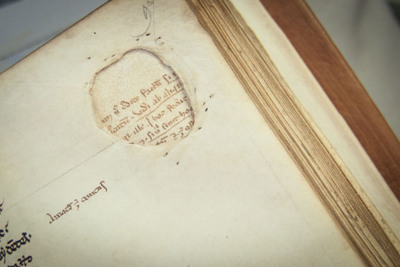
Damaged goods – ‘Be careful what you buy in the city of Erfurt: they sell you animals skins to which letters will not stick.’ This complaint of a medieval scribe shows that these craftsmen were well aware of the varying quality of animal skins, which they used as the basis for their books. However, calves, sheep or goats that had gruntingly given up their livelihood and skin for the sake of medieval readers were not always to blame.
The most common imperfections are holes produced by the knife of the parchment maker. When he cleaned the skin with his knife, it was strapped on a wooden frame: tight like a drum a small puncture easily became a gaping hole. The art of preparing animal skin was to apply just the right amount of pressure. Readers did not seem to mind the holes too much and scribes usually just wrote around them, or they repaired them.
Read more in Quill: Choosing a Writing Support
Doodles
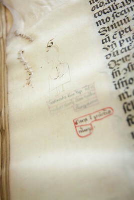
Doodles are little bundles of fun. Usually drawn with a pen, they often appear to be the result of a scribe trying out his pen. In such cases it was tempting to draw something meaningful, if absurd. Humor is a main ingredient of the doodle, which may show a mouse chasing a cat, a funny face staring at the reader, a skeleton with a glass in his hand, or a husband and wife in the midst of an argument.
Doodles often incorporate such native elements of the page. Various doodles made by children also survive in schoolbooks, which shows that doodling may also be a universal sign of boredom in the classroom.
Read more in Quill: Decorating the Book
Erasure
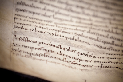
Mistake be gone! – How did a medieval scribe correct a mistake? If you forgot to copy a word, you could simply insert it in between the lines of the completed text. If you had written down the wrong word or sentence, correcting the text could take considerable more effort. In such cases scribes often resorted to their knife. Dried ink could be ‘snapped’ off the page with the knife’s tip.
Once the words were removed the correct reading was placed in the gap. However, a mistake was never fully deleted. You can often still vaguely see the outlines of the original text on the parchment, much like in a palimpsest. Moreover, the surface of the spots usually feels slightly softer, which is gives away that the scribe intervened with a knife.
Read more in Quill: Correcting the Text
Foliation
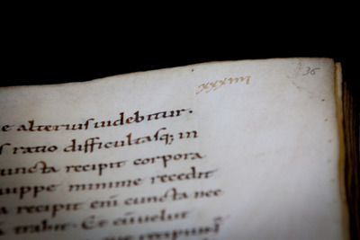
One, two, three – Until the invention of the page number readers had no means to find a particular page in the book quickly. The system medieval scribes came up with is slightly different from our modern pagination. Only one side of each leaf was given a number, meaning that medieval ‘foliation’ referred to not one but two pages. Although the practice of placing a number sequence throughout the book is observed in some earlier manuscripts, it became popular in the thirteenth century. Scholars at the university, for example, found it easier to reference information on certain pages if they were numbered. The sequential numbering of leaves allowed for the production of more detailed subject indexes and tables of contents, both of which are still in use today. Finding information was now as easy as one, two, three.
Read more in Quill: Copying the Text
Fragments
See: Binding Fragments.
Gilding
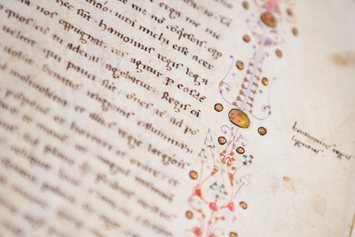
Dazzling – Some medieval readers preferred pretty pictures and shiny decoration in their books. Not only did the sparkling page appeal to them, it also proved their economic status, or that the gift they gave was special. Undecorated books were also expensive, but decorated copies cost a true fortune, especially if gold was used. In a process called gilding, the decorator would apply an ultra-thin film of flattened gold to the page, which looked not unlike our modern tin foil. Golden shapes were not appended directly to the surface of the parchment, but that they were stretched over little ‘hills’ of plaster. This way the gold would catch the light from different angles, maximizing its dazzling effect.
Read more in Quill: Decorating the Book
Gloss
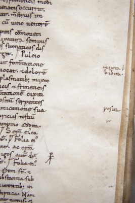
Add-on – From the moment we learn to read as a child we are told not to write in our books. Still, we often do, especially when we use the book for school. If it is not our own copy, we may write with pencil, so that our personal thoughts may be removed after use. Medieval readers had no problem writing in the margins, and apparently had no qualms about using permanent ink. In fact, it is hard to point out a manuscript that does not contain any such add-ons. Some of these notes (or glosses) were extensive, and the scribe had to extend the margins to accommodate them.
Read more in Quill: Using the Book
Gothic Script
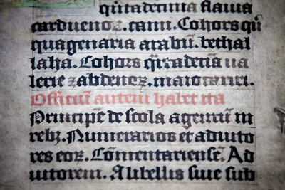
Script standards – Books written between 1250 and 1600 were copied in a variety of Gothic scripts, some of which sport very different features. On the one side of the spectrum, there are formal book hands, presenting upright letters that appear to stand at attention. On the other side there are more casual cursive scripts, which were written with a thinner pen and featured connecting loops.
By the early fifteenth century these two script forms were equally popular, although cursive script was introduced much later in book production. The introduction of cursive script is part of a broadening palette of scripts. This expansion may have resulted from the commercialization of book production - a consequence of the increasing demands of readers who purchased their books in small urban shops.
Read more in Quill: Copying the Text
High-Quality Parchment
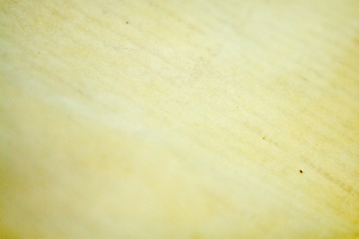
Perfect skin – Up to around 1300, most books in Europe were made from animal skin - parchment. The quality of these sheets varied considerably. Like people today, not all medieval creatures had perfect skin. Some cows loved to rub against trees and others were particularly prone to insect bites. We can still see these defects on the medieval page today, which appear as tiny holes, gaps or dark patches.
The quality of the page also had a lot to do with preparation. A scribe producing a book for his own library may be less attentive than one that worked in a monastic community. The best sheets have a deep-white color, with a hint of yellow. They feel like velvet and make a slight rustling sound when you turn the page - suspenseful whispers that teased the reader.
Read more in Quill: Choosing a Writing Support
Historiated Initial
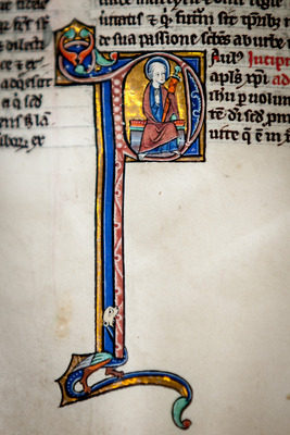
One-letter stories – Normally, letters work together to form words that present a story. From time to time, however, we encounter a letter that contains a narrative all by itself. Initials that marked the beginning of the text could contains an identifiable scene or figure that often related to the text. The meaning of some historiated initials can only be understood by reading the story they initiate. Miniatures contained even more extensive narratives.
Read more in Quill: Decorating the Book
Insertion
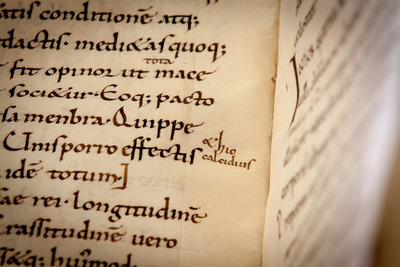
Insert [text] here – When the medieval scribe had finished his work, he or another scribe usually went through the entire manuscript to make sure he had made no mistakes. He did so while comparing his work to the exemplar, the book he had copied his text from. Mistakes he encountered would be erased.
When it became apparent that he had skipped a word or even a whole sentence or paragraph, he could simply amend it by copying the omitted text nearby. Readers would also insert missing words themselves, if the scribe had failed to do so.
Read more in Quill: Correcting the Text
Lacuna
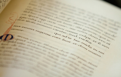
Mind the gap! – Most flaws scribes encountered when they corrected a manuscript could and would be fixed immediately. Others, however, required some time. The scribe may have wanted to deliberate the text with someone else or look something up, for example in a glossary. Such time-consuming fixes were usually done after the text was fully copied out. In such cases the scribe would leave room in the text to reinsert the checked reading at a later stage.
When he had finished copying, a text could potentially have been riddled with lacunae, standing at the ready to receive the new readings. Scribes would hide any and all traces of these corrections by using the same ink color and writing in the same manner, which means they are difficult to spot. The practice of using lacunae for inserting improved readings is particularly common in autograph copies. Translators, for example, often needed some time to find equivalents for unusual words in the original language.
Read more in Quill: Correcting the Text
Layout
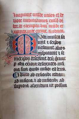
Puzzle – Before a scribe could begin to fill the quires with text, the layout of the page needed to be designed and prepared by means of pricking and ruling. How a page was designed depended on a variety of factors, including the number of required text columns, the space left blank for decoration, and the presence of marginal glosses and running titles. The most basic layout consisted of a single column of text. They are frequently encountered in Books of Hours, because these are commonly smaller books, which facilitated portability. Bigger books of two or more columns often required more work in the design stage, especially if that book also featured a marginal commentary. Particularly challenging were those cases where the commentary was of unequal length, as seen here. This meant that the scribe had to design each page separately. Piecing together the segments of main text and commentary was like solving a puzzle.
Read more in Quill: Preparing the Page
Limp Binding
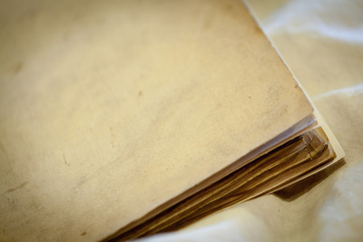
Wrapper – The majority of surviving medieval bindings made use of wooden boards which helped to protect the book and to keep the quires in place. The so-called ‘limp binding’ is another type of binding that was in popular use in medieval times. Its most notable feature is the absence of boards, which explains its name. With a limp binding the quires are covered by a plain parchment wrapper without the support of wooden boards.
The quires in these bindings – usually a limited number – are attached to the outer parchment with thin strings, which are visible on the outside. A limp binding resulted in a lighter manuscript, which meant it was easier to transport. This type of binding also decreased the cost, given that wood was not needed and that the binding process was less time-consuming. This is likely why this type of bookbinding is so popular among medieval students.
Read more in Quill: Binding the Book
Manicula
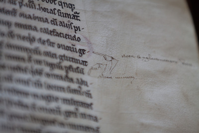
Helping Hand – With a nota-sign the reader expressed that a passage was noteworthy or deserved a closer read. The manicula (Latin for ‘little hand’) was another means to do so. As with ‘nota-signs’, the actual form of the pointing finger varies considerably. Readers may have had their own unique design to distinguish their hands from those of other readers.
The hands are sometimes accompanied by short notes, which the reader may have written in response to the text. As with bookmarks and nota-signs, maniculae show us what information were deemed important or relevant to an individual long ago. In that sense they lend a helping hand to the book historian as much as they did to the medieval reader.
Read more in Quill: Using the Book
Miniatures
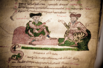
Mini paintings – Miniatures represent the most elaborate decoration on the medieval page. They encompass scenes for which a significant amount of space - and color - was reserved. Some are boxed in by a frame, while others appear to float mid air. Their size and level of detail can vary widely. Books of Hours often contain at least one full-page miniature. Some of these were mass-produced and could be picked out by a client as he ordered the book.
More common are smaller miniatures of half a page or less. These were normally added after the copying of the text was completed: the scribe would bring the completed quire to the decorator, who would subsequently do his thing. Miniatures are in effect mini paintings executed by well-known artists: they added significantly to the bill of the reader who commissioned a book.
Read more in Quill: Decorating the Book
Nota
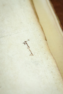
Note to self – While the bookmark guided the reader to an important chapter or text, the nota-sign marked a significant passage or sentence on the page. From time to time readers noticed something in the text worth highlighting. In such cases they wrote the Latin ‘nota’ in the margin, which means to ‘examine’ or ‘inspect’. While some of these nota-signs may have served as a reminder to check something, others appear to express a more generic ‘attention!’ like the ‘manicula’ did.
The nota-sign is not written like a normal word. Rather, its four letters are reshuffled and stretched so as to form a unique symbol. This was likely done to distinguish a reader’s passages from those marked by other users of the book, such as his fellow brethren in the monastery.
Read more in Quill: Using the Book
Notes
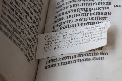
Sticky note – Readers had the ability to mark important passages with a nota-sign or a manicula. When a passage prompted a response or an explanation, the reader could provide these in the form of a marginal gloss. More extensive notes were sometimes written on tiny paper or parchment slips.
Students are known to have used them to take down notes in the classroom or when they were studying a text at home. Few of them survive today. Not only were they easy to lose, but many of them were actually thrown out, similar to the fate of our modern day ‘sticky notes’. In some manuscripts they survive because they were tucked in between the pages.
Read more in Quill: Using the Book
Offcuts
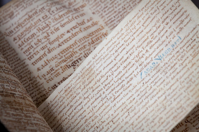
Yellow sticky note – When the scribe cut sheets out of the animal hide, he would normally use the best part of the skin - what may be called the ‘prime cut’. This meant staying clear of the very edge of the skin because these areas were very thin and translucent, and deemed unsuitable for books. The scribe therefore cut a rim of parchment from the edge of the skin. It usually came off in tiny bits and pieces, which he called ‘schedulae’ - strips.
These odds and ends were thrown in the bin. Sometimes they were taken out to be used as scraps, for example for taking notes in the classroom. They also served as smaller pages inserted into existing manuscripts. Tipped into the quire these tiny pages supplemented the text or added notes, like yellow sticky notes.
Read more in Quill: Choosing a Writing Support
Palimpsest
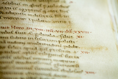
Stowaway – What to do when you run out of parchment as a medieval scribe? You can look around for something else to write on, such as left-over parchment strips in the bin (schedulae), or use paper if it is available. Alternatively, you can take a book that is no longer used from your monastery’s library and scrape the text off its pages. You then simply reapply text of your own. Such recycling resulted in a ‘palimpsest’, which held a removed ‘lower text’ and a newer ‘upper text’.
The ink of the reapplied text often does not stick to the page very well. Moreover, the older reading often shines through. Especially important are palimpsests from the earlier Middle Ages, because underneath this old text an even older work is buried, like a stowaway. With digital photography the lower text can sometimes be made visible again, which makes studying these books like digging for treasure.
Read more in Quill: Choosing a Writing Support
Paper
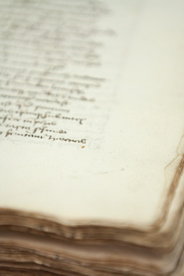
The cheaper alternative – Paper became an alternative to parchment in the later Middle Ages. The new material was introduced into Europe in the late twelfth century. Initially imported from the Arabic world by merchants, from the second half of the twelfth century paper was also produced in European mills, first in Italy and Spain, then in France, and finally in England and Germanic countries. At first, the new material was exclusively used in administration.
It was not until the late thirteenth century, however, that paper was introduced in book production, where it became a more affordable (and sometimes more plentiful) alternative to parchment. Although paper made the production of manuscripts somewhat cheaper, the objects still remained expensive: they were a luxury good for people with less money. The watermark that is usually found in a paper sheet helps the book historian date and localize the paper batch used for a manuscript.
Read more in Quill: Choosing a Writing Support
Paragraph
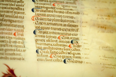
Gallows – Both longer and shorter medieval texts were usually divided into smaller sections called paragraphs. In the early days of the paragraph, in the ninth century, they often had the appearance of a plain ‘hook’ resembling the gallows. In the eleventh and twelfth centuries more sophisticated variants began to appear. First, diagonal lines started to connect the horizontal and vertical part of the paragraph.
Then, in the age of the scholastic book, the reading aid received our modern shape: a ‘c’ with a vertical line struck through its centre. In scholastic texts this type of paragraph often came in two alternating colors: red and blue. They appear to mark the ‘lector’, the passage that was read out loud in the classroom an which was subsequently discussed. The c-symbol indicated the start of such a passage, while the colors made it easier to know when to stop reading.
Read more in Quill: Copying the Text
Parchment
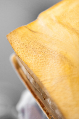
Dead cows – What was once a calf, sheep or goat frolicking grazing in the meadow, may now be a page in a manuscript. That is not a bad way to go. It is a strange experience leafing through a medieval book, knowing that you are touching an animal that stopped breathing over 500 years ago. Sometimes the page shows the tiny dots where the hairs once grew. Up to c. 1300 books in Europe were almost exclusively made from animal skin. Then scribes started to use paper, tempted as they were by the lower cost of the material.
However, parchment was regarded as the more durable of the two: ‘If you want a real book, use parchment’ was the sentiment in the streets, which is why some scribes, particularly monks, were hesitant to use paper as default material. When in c. 1450 the printing press arrived, animal skin quickly became obsolete, although the trend was already set half a century earlier.
Read more in Quill: Choosing a Writing Support
Pen Trials
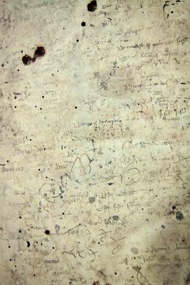
Testing, one, two, three – Scribes had to constantly adjust the nib of their quill by cutting it into the right shape. A deformed nib would not supply an even flow of ink, which resulted in letters that were not fully formed. To test if the nib was in good shape, scribes would scribble a few swirly lines or short words on an empty page. We usually find these pen trials in the back of the book, where empty pages were usually found. Some pages are loaded with them, including many that are written upside down, which shows just how little the scribe cared about what his pen produced during the testing phase. The most famous pen trial written in Dutch is a poem jotted down by a monk who laments how all birds are building nests, but that he, alas, is not. Anything goes for a trial.
Read more in Quill: Copying the Text
Penwork Flourishing
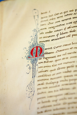
Drunk decoration – In medieval times, penwork flourishing was the quickest and easiest way to add some color to the page. This style of decoration typically involves thin lines, usually in red and blue, drawn with a pen rather than a brush. The swirly lines form lively patterns with unexpected twists and turns, creating miniature mazes in which your eye gets lost easily. If you look carefully you may recognize familiar objects: a tree, the moon, pearls, a smiling face. The central figure attracting all of this artistic attention is the capital letter that needed decorating. The penwork decoration supported an important function of this letter, navigating the reader to the beginning of a new section of text. The specific flourishing patterns can often be pinpointed to a certain city or region, which turns these happy lines into a useful tool for the book historian
Read more in Quill: Decorating the Book
Pre-Gothic Script
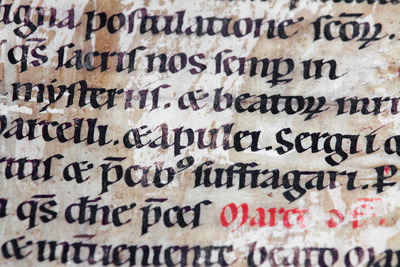
The divider – From the middle of the eleventh century Caroline Minuscule, the dominant book script at that time, started to include new letter forms. By 1100 the number of letter transformations had grown to such an extent that the script looked different from Caroline. Slowly the script evolved into what may be regarded as the second major book script of the Middle Ages: Gothic (used from c. 1225).
Where Caroline was a unifying script, the transitional script of the Long Twelfth Century (1075-1225) divided Europe in distinct regions. Scribes in Europe adopted the new, hybrid writing form at different speeds, while they also varied the actual appearance of certain letter forms. Scribes in Germany, for example, were far more conservative than their peers in France and England.
Read more in Quill: Copying the Text
Pricking and Ruling
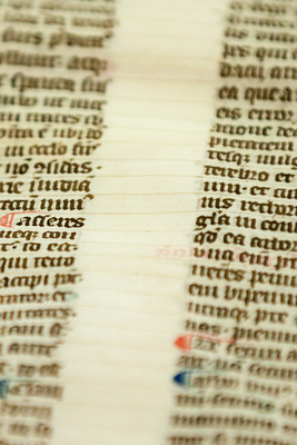
Cobweb – Unlike our notebooks today, medieval paper and parchment sheets did not come with ruled lines when you purchased them. A medieval page consisted of both horizontal and vertical ruling. To add these guiding lines to the blank page, the scribe would prick tiny holes in the outer margins, as well as in the upper and lower ones. Lines were then drawn between these holes, usually with the help of a ruler: horizontal lines to guide the space between each line of text, and vertical lines to confine the left and right side of the textblock.
Until the early twelfth century the ruling was done by pressing down on the parchment with a sharp object, producing a ‘gutter’ that would guide the scribe’s pen (called ‘dry point’). This type of ruling was replaced by drawing lines with a pencil or pen, which left more visible traces on the surface of the page (called ‘plummet’). If a layout was very complex, the ruling pattern may appear as a cobweb of horizontal and vertical lines.
Read more in Quill: Preparing the Page
Punctuation
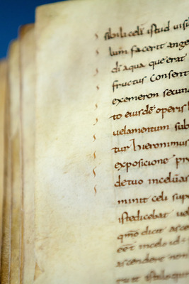
Quoting, quoting, quoting – Most of modern punctuation was available to medieval scribes, although they sometimes used it differently than we do today. In medieval times, the period at the end of the line may for example be expressed with a different symbol, such as a triple dot or even a comma. Medieval quotation marks are placed in the margin and not in the actual text. Moreover, the symbol is repeated over and over again in front of the quotation. When the symbols stop, the quote is over. This practice is a good example of the simplicity and effectiveness of medieval punctuation.
Read more in Quill: Copying the Text
Quire
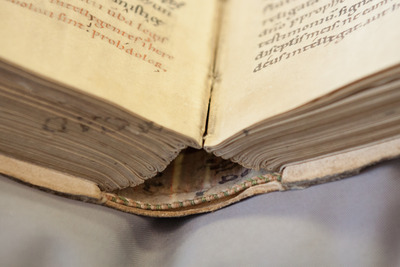
Building blocks – Quires, which were produced by bundling together a number of bifolia, form the building blocks of the manuscript. How many bifolia the scribe bundled together often depended on his or her location. Book producers in England, for example, are known to have regularly produced quires of six bifolia, while scribes on the Continent typically preferred quires of four bifolia. Some quires are irregular. An extra folium could be added (called a singleton) or a leaf could be cut out.
Such instances of irregularity are of great interest to book historians, because they may suggest that the original composition was expanded by the scribe (for which an extra folium was needed) or because a blank folium was removed at a later stage (it came in handy for taking notes). Scribes often produced the quires themselves, but it also appears that they used prefabricated quires on occasion.
Read more in Quill: Making Quires and Sheets
Reading Aids
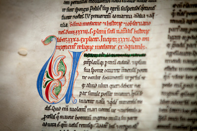
Navigating the book – Medieval scribes recognized that readers may need some help finding their way throughout the book or within the texts they contained. Over time, a number of tools were invented to this end. Many of them we still use today, such as the page number (foliation), the running title, and the index.
In medieval manuscripts colorful initials marked the opening of a new chapter. Thumbing through the book, in search of a particular section of text, the letters would jump out at the reader. Another important tool for finding certain information was the rubric: red lines that indicated what the next section will discuss. Lines highlighted with a green wash expressed where the reader should start reading. Combined, these three are a clever lot, helping the reader navigate the book and text at a fast pace.
Read more in Quill: Copying the Text
Rubric
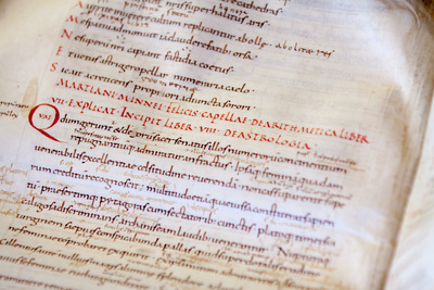
Spoiler – As Spanish bull fighters know, red is an excellent color for attracting attention. In manuscripts it was used for the rubric (from the Latin word for ‘red’). Placed at the outset of each chapter, rubrics provided the reader with an indication of what the following chapter was about. Now that was handy! Some were very short and simply stated ‘about such and such’ while others were quite elaborate - spoilers, even, which revealed in detail what the reader was about to read.
The color red set the words apart from the black or brown words of the main text. Moreover, the bright color on the otherwise dull page acted as a reading aid: it helped the reader find certain information in an efficient manner. If red was not available, scribes would write the chapter titles in a different script to make it stand out from the main text.
Read more in Quill: Copying the Text
Ruling
See: Pricking and Ruling.
Running Title

You are here – Running titles have a long history. They are encountered in manuscripts made as early as the sixth century. Their main use was to indicate to the reader where in the book he or she was. Early examples merely reveal the given book within the text - stating, for example ‘Liber primus’ (Book 1). With the coming of the scholastic manuscript in the late twelfth century, used at universities throughout Europe, the running titles became more sophisticated. They would often provide the reader with the full title of the text at a given page.
Moreover, the presentation of the running title became smarter as well. It became split up and spread out over both top margins of a book opening: half of the text title on the left page, the other half on the right page. An equally early adopter of this clever type is the Paris Bible, a popular tool among preachers on the road. Like students, they needed to find texts and passages quickly. ‘You are here’ they seem to say, ‘Now you do your thing’.
Read more in Quill: Copying the Text
Scribal Colophon

Give me drink – The medieval manuscript lacked a title page, which was invented by fifteenth-century printers. Without a title page, it can be difficult to determine where, when, or by whom the book was made. To the medieval reader, however, much of this information was either irrelevant or already known. Why state that a text is by Augustine if you can easily determine that yourself by simply reading the first lines?
Lucky for us, on occasion, scribes added a colophon to the book (almost always found on the last page). The colophon provides us with similar information now copied onto title pages. A scribe may state, for example, in which year he copied the book, where he lived, and, in some cases, even for whom the book was made. Some colophons provide a more prosaic fact, for example that a scribe is thirsty: ‘This work is completed, master, now give me a drink!’
Read more in Quill: Copying the Text
Script
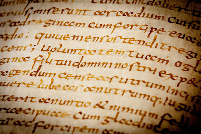
Between the lines – Medieval script - the handwriting of the scribe - is the material representation of a text. An author may have composed the text, producing the original thought, poem or story, but it was often the scribe who put these words on the page. Much rides on how he did this. If he was inexperienced, it may be difficult to decipher his writing. If he was sloppy, the wrong words may appear on the page, or the right ones in the wrong order.
The handwriting of scribes varied considerably. Not only did individual scribes vary their individual letter forms, as we still do today, but style of medieval script often depended on when and where it was written. This makes script extremely useful for book historians: the producer of a manuscript may tell us, between the lines, where and when he made the book. My maker is from Germany, a letter or abbreviation may for example say. From time to time scribes would even say so explicitly, in a colophon at the end of the book.
Read more in Quill: Copying the Text
Signatures
Signe de Revoi
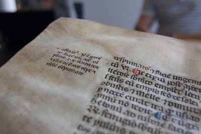
X marks the spot – When a scribe noticed that text was missing he usually inserted the missing words next or over the place where they were needed. The reader would know when to read them from the context. However, if the omission encompassed one or more lines it could be challenging to determine at which point they should be read, and the correction may not have fitted between the lines of the text.
In such cases the scribe would reach out to the reader and connect the marginal insertion to its proper location with a symbol called a signe de renvoi. They were usually simple symbols, such as crosses, lines, or sequences of dots.
Read more in Quill: Correcting the Text
Watermark
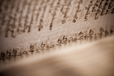
If you look carefully at a medieval page that is made of paper, you notice a shape hidden inside, such as the head of an ox, a bell, or a jester. These little ‘drawings’ that show themselves when you hold a light behind the page are watermarks. They are a byproduct of the production process of paper. The papermaker used a kind of screen to scoop up the mush of cloth from which paper was made.
The water would be pushed through a roster or sift at the bottom of the screen, while the cloth fibers that remained behind formed the pulpy beginning of a page. These screens were fitted with drawings made from thin metal strings. Each papermaker had his own picture with which he ‘branded’ his product. Because the screen was replaced every few years, these watermarks now form a great tool for dating medieval paper manuscripts.
Read more in Quill: Choosing a Writing Support
Wax Tablet
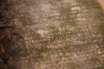
Tablet – This clever device from Antiquity provided the user with a layer of wax on a wooden frame to capture his thoughts. With a little pressure from the stylus, words were etched into the wax. They could easily be wiped away again, so the device could be reused. A little pressure from the stylus would create ideas, which could subsequently be wiped again. The classroom was a place where wax tablets were used on a daily basis, at least up until the fourteenth century.
Read more in Quill: Choosing a Writing Support